Rebrand Campaign for Live Entertainment Company
Brand Identity / Digital / Print / Environmental
SceneWorks is a rebrand of Ticketmaster imagining a post-monopoly future with a much warmer, democratic tone of voice. Inspired by urban planning and civic architecture, it focuses on structure that supports live culture, prioritizing access, transparency, and community over corporate control.
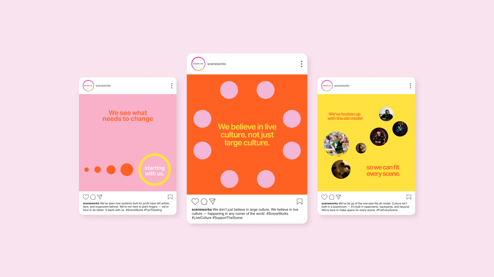
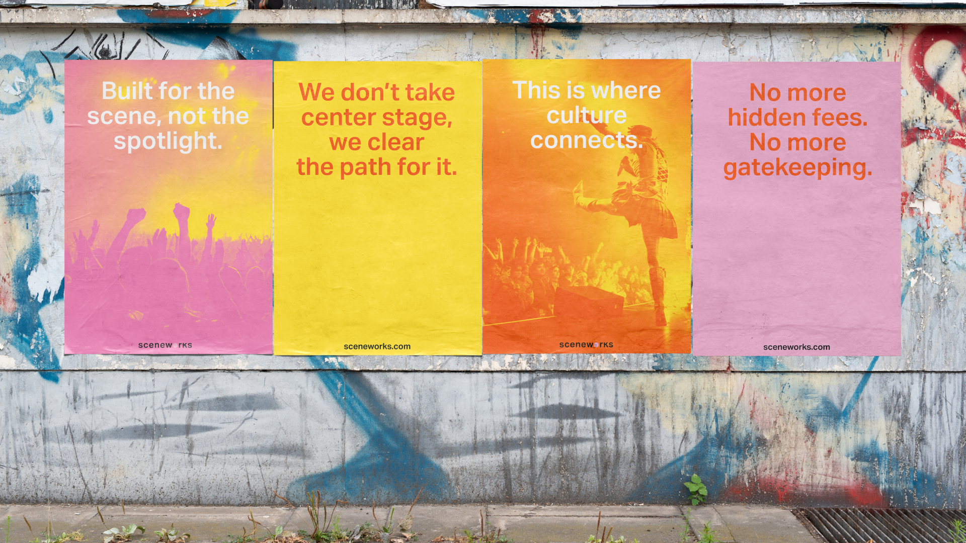
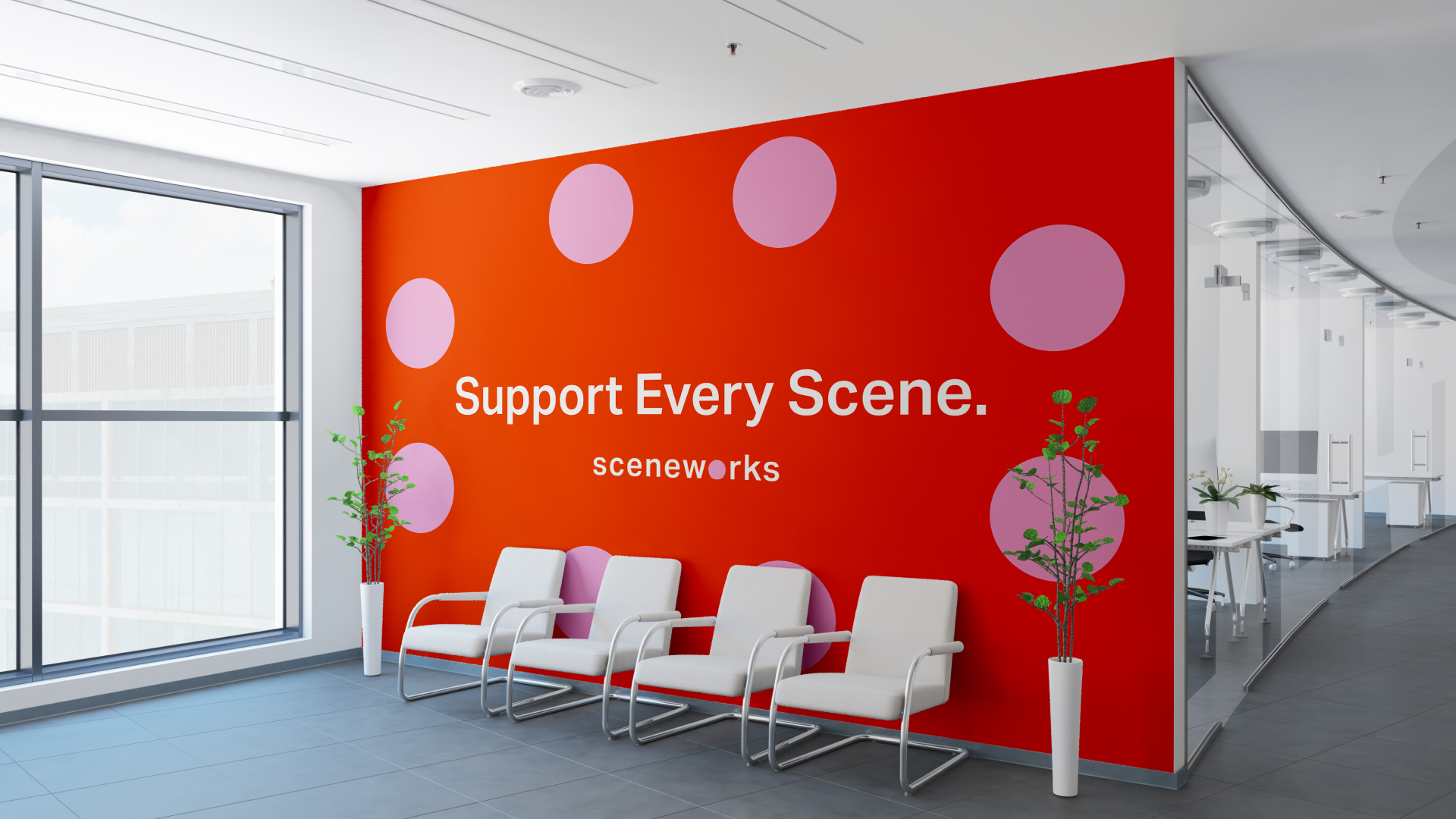
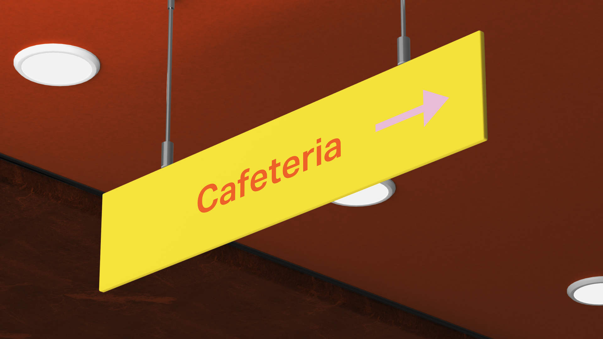
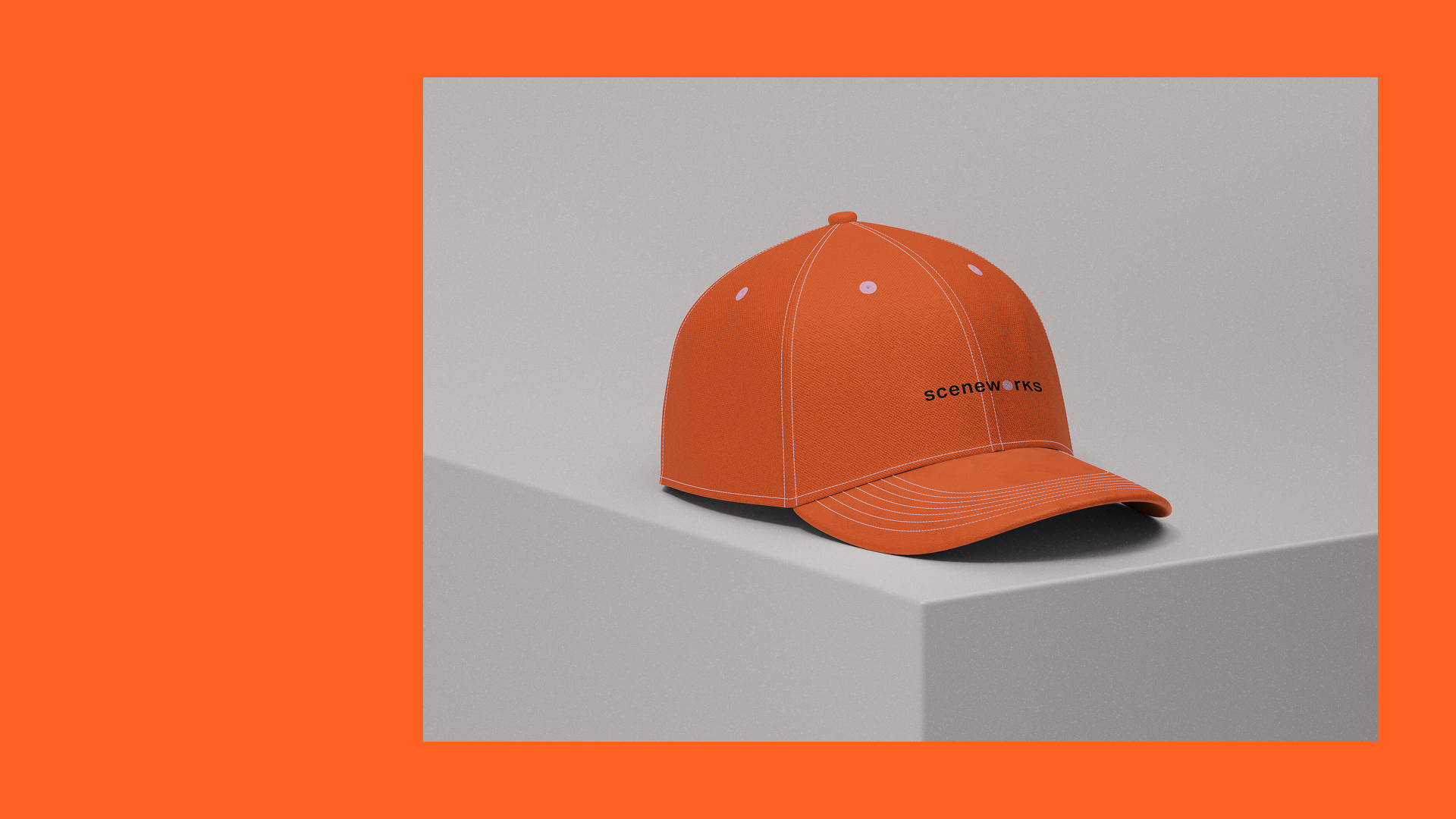
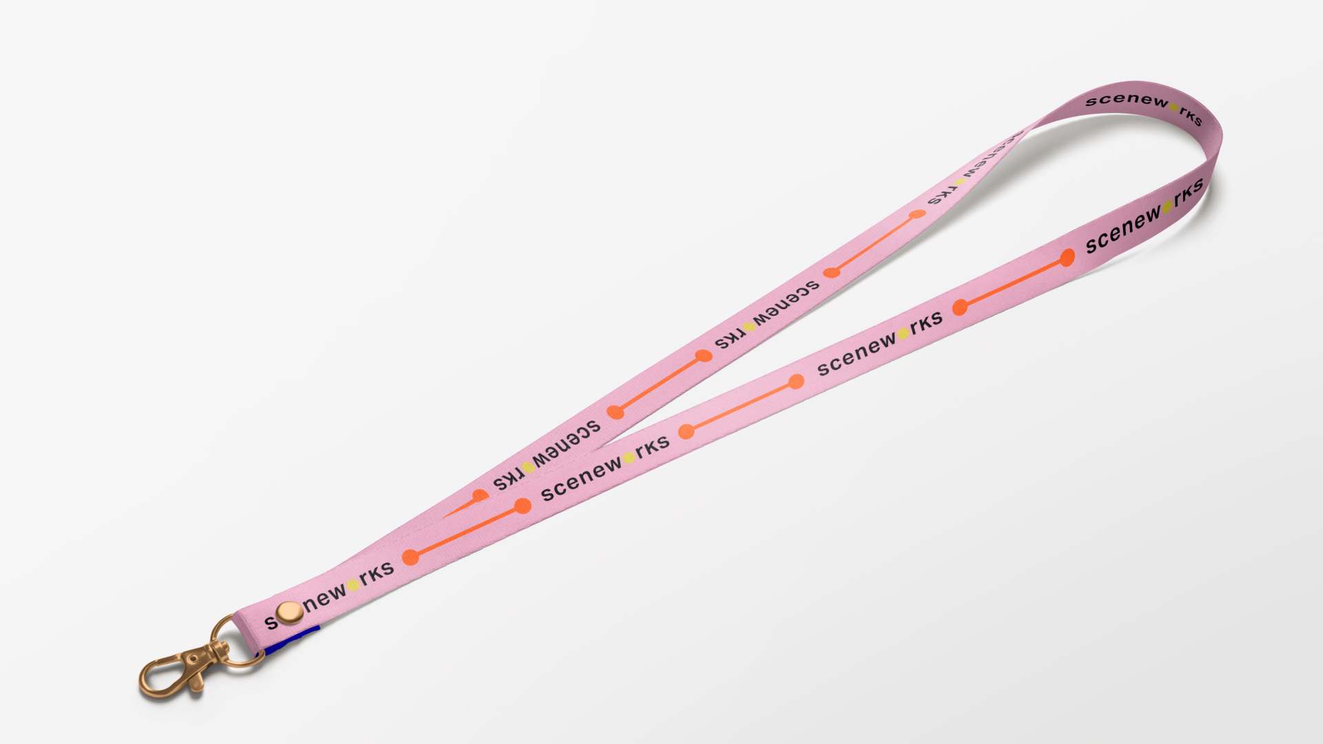
Using a combination of Figma, Indesign, Illustrator and Photoshop, I created a campaign consisting of social media marketing assets, wayfinding signages, merchandise and posters within the span of 2 weeks.


Brand Insights/Weaknesses
Browsing through Ticketmaster’s website and searching for reviews online, these are some insights I have found that give a reason to a rebrand.
(1) Transactional Brand Perception
Ticketmaster positions itself as a ticketing utility. The experience lacks excitement, enthusiasm, or a fan-first narrative, reducing live events to cold transactions.
(a) Gen Z (18–24)
mobile-first, culture-driven, discovery-minded
(2) Corporate & Detached Tone
With little brand voice beyond promotional copy, Ticketmaster feels impersonal and corporate, rather than a brand that celebrates community and culture.
Target Audience
(b) Millennials (25–45)
value fairness, community, curated experiences
(3) Disjointed Promotions
Seasonal offers and discounts are visually and structurally separate from the main experience, making them feel forced rather than integrated into the fan journey.
(4) High Fees & Low Transparency
Hidden charges and surcharges are a consistent complaint among fans. This reinforces distrust and positions the brand as exploitative rather than supportive of live culture.
“How might we make live entertainment more sustainable, fair, and unforgettable for artists, fans, promoters, as well as venues to transform this business from a transactional platform into a cultural connector.”
New Name, New Brand Values
Transparency
Because trust should come standard. From pricing to policies, there should be no more hidden fees, but more honest, so audiences know exactly what they’re buying and artists know exactly what they’re earning.
Accessibility
Because everyone deserves a seat and a stage. Whether you're a fan with limited means, a new artist trying to break through, or a local venue hosting your first gig. Ticketmaster should open doors, not gatekeep.
Community
Because live events are about who you share it with. Live moments spark connection between people and art. Ticketmaster should nurture the spaces both physical and digital, so artists, fans, venues, and scenes grow together.
scenew●rks
●—●
scenew●rks ●—●
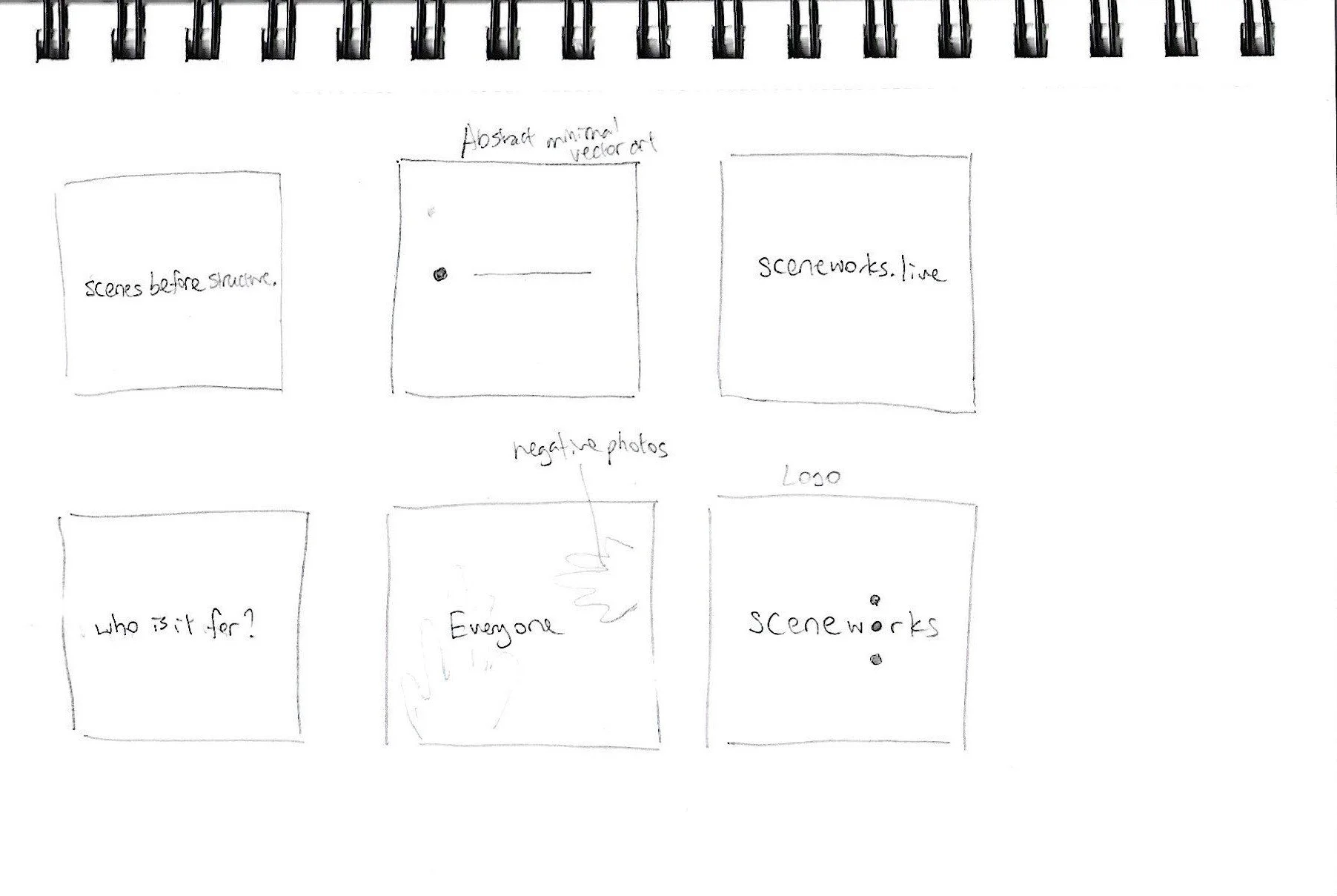
Concept Development
Through word association sprints based on the brand values, I landed on 3 visual keywords: Structural, Democratic, Assertive.
Via these 3 visual keywords, I thought of the architectural design of civic spaces, circuit boards, and subway systems which led me to create a brand system inspired by urban planning, public architecture and civic spaces.
Sceneworks is, “A Grid for All Scenes.”


Process Methodology
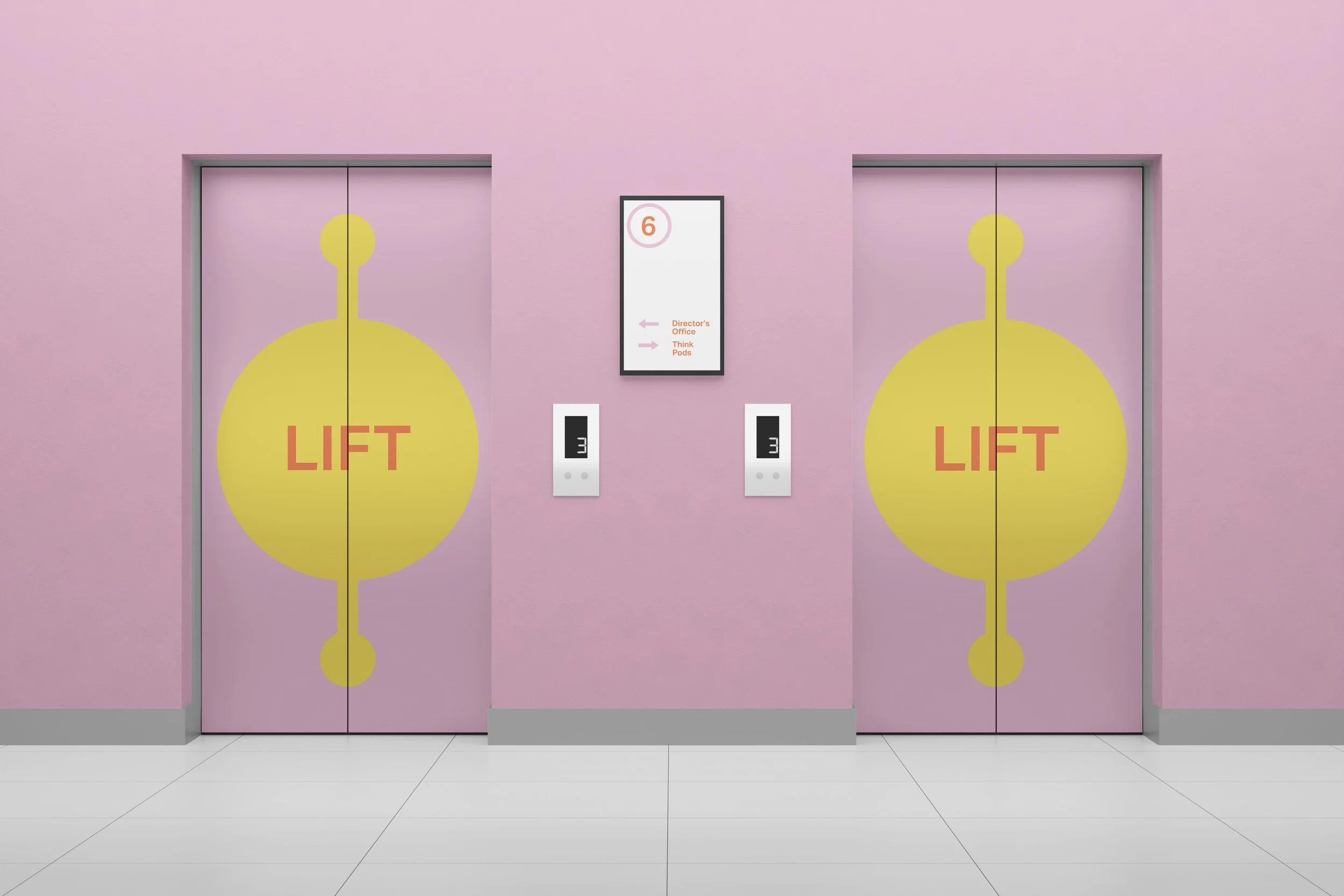
Inspired by the works of Josef Müller-Brockmann, Armin Hoffman, and Massimo Vignelli. I played with the idea of circles and nodes because I thought circles encapsulated democratic values and the idea of community, in which the lines are the interconnective tissue between these communities making the brand feel open and shared rather than exclusive. The circles are played like spotlights, meditation circles, circuit nodes and subway directions. The layout choices and visual system are meant to serve all fans equally, mirroring the brand’s mission of fairness.
the arrangement of the text boxes and circular motifs adhere to the structural alignment that is signature of the international swiss style. The visuals were deliberately arranged in a way that emphasized order, clarity, and support. This gives the identity a sense of foundation, almost like infrastructure for live events, emphasizing “a grid for all scenes.”
I was assertive In tone and visuals, SceneWorks was designed to be confident and bold without being aggressive. This came through with the use of Aktiv Grotesk, clear hierarchy, and the way I let the visual system speak for itself, commanding attention while still grounded in function-first design.
the color palette is warm and inviting, balancing bold tones with approachable warmth. It’s designed to feel energetic enough for live entertainment, while still approachable and human.
Most importantly, The tone of voice is clear, grounded and people-first, speaking with transparency and accessibility while positioning SceneWorks as the quiet infrastructure that enables live culture to thrive.


Takeaways and Learnings
Translating Abstract Brand Values into Tangible Visuals
It is one thing to talk about transparency, community, and access, and another to embody them visually. Grid-based layouts (structural), circular motifs and crowd imagery (democratic), as well as bold typography (assertive) became the ingredients I used to turn brand ideals into a clear design language.
Balancing Digital, Print, and Environmental Contexts
Extending the identity from screens to signage, wayfinding, and merchandise forced me to think more about materiality, scale, and legibility. What reads well on a phone may lose clarity on a banner. Designing across contexts sharpened my awareness of these constraints.
Skills Acquired
Translating brand mission into visual systems (beyond just logos).
Designing for cross-platform and cross-media coherence.
Navigating constraints of scale, readability, and user interaction in physical environments.
Developing tone, voice, and messaging as part of identity.
User Empathy and Brand Trust Matter
Feedback consistently surfaced issues like hidden fees, disconnected promotions, and a cold tone. I learned that trust through transparency and voice is not optional for entertainment brands. Design that builds clarity and consistency is just as important as aesthetic polish.
Iterative Process Clarifies Intent
Sketching, moodboarding, and testing signage or merchandise layouts revealed gaps I had not considered. Thinking through how a sign works in daylight or how a lanyard feels in use taught me more than refining a single digital mockup.