
Website Destination for Touring Company
Brand Identity / Digital
Berlin Beat is a company that provides curated tours led by locals in Berlin, the company needed a mobile-first website to get cultured customers to book tours with ease.
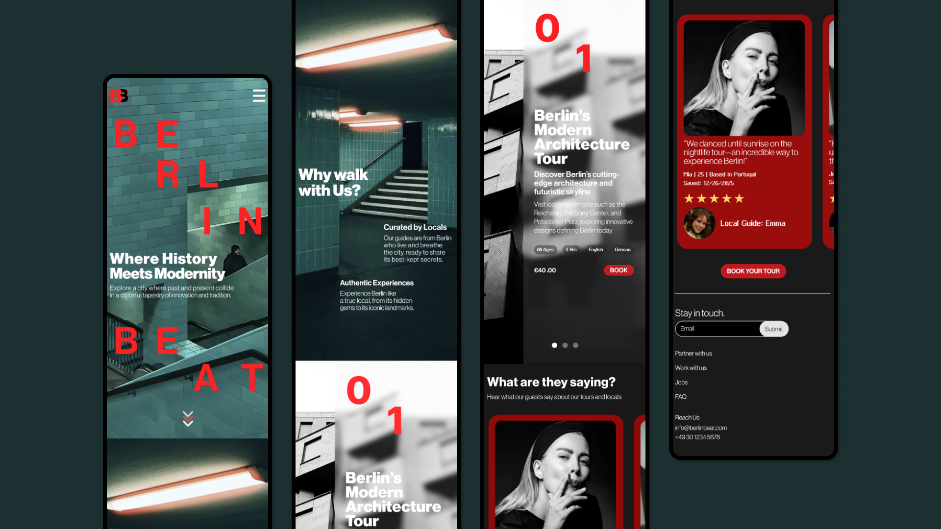
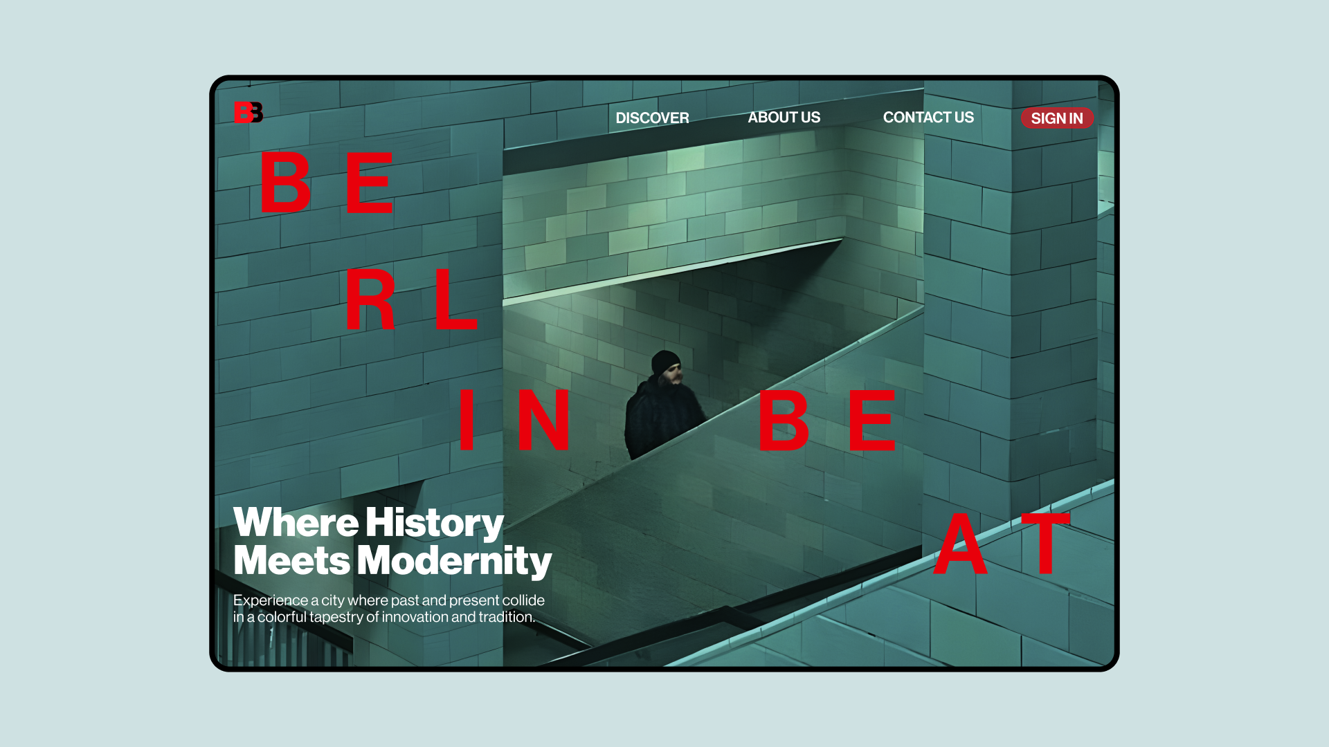
Inspired by the tension between Brutalist precision and poetic nature of Berlin’s free spirited technological romanticism, I designed a mobile-first website and expanded it into a full desktop website created within 2 weeks through design sprints using Figma.

Concept Development
The client wanted the website to capture the essence of both the destination and tour experience. With Berlin having had a history of creative destruction within politics and a relentless appetite for technological advancement through social innovation I wanted to apply a visual language that connotes the free-spirited nature that has allowed Berliners to thrive on forward thinking subcultures and technological romanticism.
User Research
For history buffs, art lovers, and culture enthusiasts, ages 30-65. These are cultural explorers seeking to immerse themselves in the local heritage, history, art, and traditions of a city. They are likely to attend museums, historical sites, festivals, and performances. The client indicates that the design should convey a strong sense of place, but how to present cultural richness is open to interpretation.

I used a contemporary sans serif font, Neue Haas Grotesk Display Pro, to portray Berlin’s function over form philosophy and its modernity through cultural forwardness. Swiss Siena is used in the details to reflect the city’s technological romanticism, pairing well with Neue Haas Grotesk Display Pro within the confines of Swiss style while contrasting from it through its pixelated form.
Berlin being the leader in fashion, arts, architecture and music, I was inspired by 032C magazine and chose Pantone Red to show the boldness in the people’s experimentation within the arts. Charcoal Black is used against the red as well as Dark Teal colors using images of the Alexanderplatz subway to create a grungy, mysterious feel that is signature of Berlin’s atmosphere.
Process Methodology
From iterations through sketches, and transforming these ideas first into lo-fidelity wireframes then to hi-fidelity wireframes, and subsequently into its final design, I was able to follow an efficient process of translating my ideas swiftly from paper to digital.

Tour Cards Sketch

Lo-Fidelity Tour Cards

Hi-Fidelity Tour Cards

Final Tour Cards
Outcome & Reflection
While I didn’t have access to quantitative business metrics post-launch, the design achieved its primary goals: the site is visually resonant with the target demographic, and the feedback from stakeholders confirmed it captures Berlin’s blend of cultural richness and technological energy. The mobile-first architecture ensured ease of navigation on smaller screens, and the desktop layout scales the visual impact appropriately.
What I learned
This project strengthened my ability to translate abstract cultural themes into visual and interactive design systems. I refined skills in rapid iteration, design sprint methodology, and balancing aesthetic considerations with usability constraints.